





Trade presentation
October 2026
Identity
2026
None of this is normal
Who it is for
People who drink meet our brands. Trade, partners and investors meet Mack Brands.
So the identity is built for the trade, not the shelf.
An all in-house marketing agency that happens to make great beverage brands.
Every one of them has real roots.
One thing out of place.
Everything is set on one star and one grid: eight points, angles of 45° and 22.5°, sixteen columns. Then one thing breaks the order on purpose: a bird flying the other way, the Lime eye, the course across the chart. None of this is normal.
Contents
Every page here sits on the identity’s own grid: sixteen squares across, the margin one square. Press G to see it.
The mark
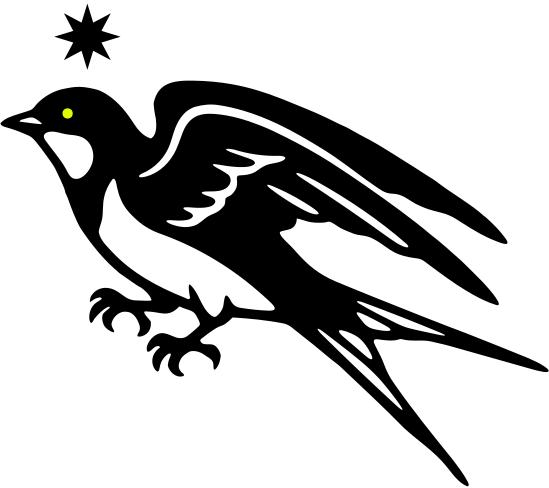
The swallow
Swallows cross continents and come home every year. Sailors wore them for a safe return, with a star to steer by.
Wordmark
x-height of Mack, cap height of BRANDS
One baseline
Mack in PP Editorial New Italic. BRANDS in Neue Montreal Bold. The x-height of Mack matches the cap height of BRANDS, so both words share one top line and one baseline.
Stacked
For square and centred formats. BRANDS runs from the first stroke of the M to the end of the k, half its own height below Mack.
Clear space and size
x
Smallest: 120 px or 30 mm wide
x
Smallest: 80 px or 20 mm wide
x is the cap height of BRANDS. Keep at least x clear on every side.
Typography
PP Editorial New Italic
Mack, headlines and the big moments.
Neue Montreal Bold
BRANDS, short headlines and labels. Always in capitals.
Neue Montreal Regular
Everything else: copy, captions and details.
Type in use
Type over it
Set lines the way the wordmark is set: italic for the voice, bold capitals for the point. The italic’s x-height matches the height of the capitals.
Which logo where
Pick the ground you are working on. Ink logos go on Paper, White and Lime. On Ink, use the White or the Lime logo.
Graphic language
The star
Everything is built on the star. Its eight points give the angles: 45°, and half of it, 22.5°. The swallow gives the scale. Each pattern keeps one rule and breaks it once.
One out of place

One rule, broken once. The odd one always sits on the grid, never at random. On Ink it is Lime. On Paper it shows by direction or weight.
Formation
The repeat. Swallows in streams on one heading, 22.5°. In every tile one bird flies home the other way. For grounds, linings and wraps. Keep type off it.
Rhumb
The chart. Sixteen stars on a hidden circle; from each, the 32 compass winds run to the edge. Move the centre to suit the format. The course, on the swallow’s heading, is the one Lime line.
What a rhumb is
Old sea charts were covered in straight lines fanning out from compass stars. Each line is a rhumb: a course you can sail on one compass heading. A navigator laid a ruler from port to port, found the line that ran closest and held that heading. Our Rhumb is that chart, drawn on our grid.
01 One star, 32 lines
A compass star sends out 32 lines, one for every point of the compass. Each is a heading you can hold.
02 Sixteen stars
Sixteen stars sit on a circle nobody sees. Draw every line from every star and they cross into the chart.
03 One course
One line runs at 22.5°, the swallow’s heading, into the centre. It is the only Lime line: the one thing out of place.
Use it as a ground on walls, covers, linings and screens. Move the centre to suit the format and let the lines run off the edges. Never more than one Lime line.
Signal
The swallow drawn in its own star, on a 45° screen. Star size follows the tone. The eye is the one Lime star.
Signal: dither and type
Dither. One star size; the tone decides which stars are drawn. The swallow comes apart along its heading.
Type. Editorial New drawn in stars. The dot on the i is Lime.
Signet

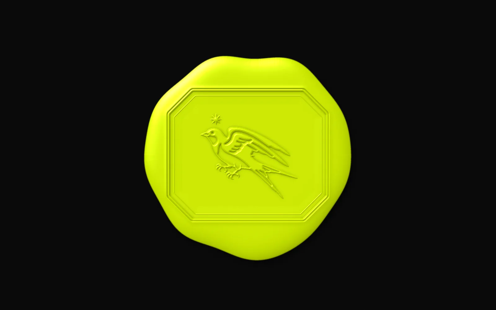
The seal. An emerald-cut octagon, corners at 45°, the swallow cut in. No type, so it holds at 15 mm. Solid for stickers and closures, line for foil and blind emboss, Lime wax for trade gifts and investor packs.
Hallmark
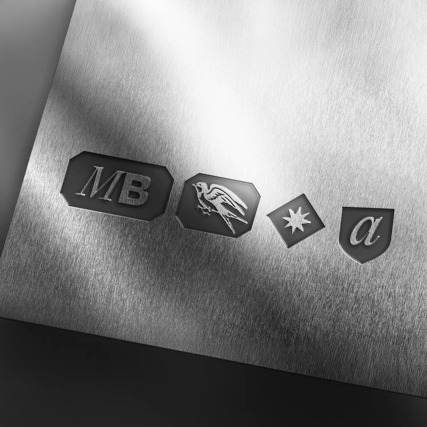
Proof, the way silver is proved. MB is the maker, then the swallow, the star and the date letter: a for 2026, b for 2027. The date punch is struck off true, in Lime. Engraved on decanters, flasks and closures; printed small on certificates.
Grounds
What sits on what. Lime marks only go on Ink: on Paper and White they disappear, it’s the same brightness. A Lime field with Ink on it works anywhere.
Design system
The working parts
A grid of squares, six text styles, four colours, and the components made from them. All of it lives in the Figma file as styles, variables and components.
Grid
Sixteen columns, like the sixteen stars on the chart. A 1920 × 1080 page is sixteen by nine squares of 120 px, and the margin is one square. Titles hang from the top margin; text stands on the bottom one. Pictures fill the page or bleed off an edge, from a module line.
Formats
Module 120 px
Module 67.5 px
Module 67.5 px
Module 13.125 mm
Module 67.5 px
Every format is sixteen modules wide, and the margin is one module. Rows are square and run from the top. Where they don’t divide evenly, the remainder goes to the bottom margin.
Splits
Signet
Formation
Signal
Split the page on a module line. Halves, or five and eleven: the nearest line to the silver section, 1 : 1 + √2, which is also the slope of the swallow’s 22.5° heading. Or give the page to the picture. Never thirds.
Type scale
| Specimen | Style | Slide, px | Print, pt |
|---|---|---|---|
| Normal. | Statement | 200 / 92 / −2% | 88 |
| None of this is normal. | Title | 72 / 100 / −1% | 32 |
| Trade, partners and investors | Headline | 30 / 110 / +2% | 13 |
| Running text, in the sans, set ragged right. | Body | 22 / 150 | 9.5 |
| Captions, values and small print. | Small | 18 / 150 | 8 |
| Labels, tags and table heads | Label | 18 / 120 / +8% | 8 |
Sizes are for the 1920 slide; a slide printed on A4 gives the print sizes. Every style trims to its capitals: a text box starts at the cap height and ends on the baseline. On this site the sizes follow the module, so they keep their proportions on any screen.
Setting text
Ragged right
Text sets ragged right from a hard left edge. Never justified, and never centred, except a single line on a cover.
The voice and the point
None of this is Normal
Serif italic for the voice, sans capitals for the point. No bold serif, no italic sans.
Capitals, tracked
Trade and partnersTrade only
Capitals only in the sans. +8% at label size, +2% from headline size up.
Figures
| Year | Cases |
|---|---|
| 2024 | 6,240 |
| 2025 | 9,100 |
| 2026 | 12,410 |
Lining figures, aligned right in tables. Thousands take a comma, as in Excel.
Measure
Lines of 45 to 75 characters. At 22 px that is four to seven modules wide, so the eye finds the next line.
Punctuation
“ ” – × °
Curly quotes, spaced en dashes, real signs: 6 × 750 ml, 22.5°. British spelling.
Six rules for setting text. Most things that look wrong in a layout break one of them.
Colour in use
| Mark on | Ink | Paper | White | Lime |
|---|---|---|---|---|
| Ink | – | 17.4:1 | 19.7:1 | 17.3:1 |
| Paper | 17.4:1 | – | 1.13:1 | 1.01:1 |
| White | 19.7:1 | 1.13:1 | – | 1.14:1 |
| Lime | 17.3:1 | 1.01:1 | 1.14:1 | – |
None of this is normal.
Contrast by WCAG 2. Ink against Paper, White or Lime clears 17:1. Lime and Paper have the same brightness, 1:1, which is why Lime never sits on Paper or White.
Lime is outside CMYK. Print it as a spot colour and draw it down on the real stock before signing off.
Components
Tag
Trade onlyNewLimited
Link
View the rangeList
- The star is the bullet, centred on the x-height.
- One idea to a line, in Body text.
Quote
The quote, in the words of the person who said it.Name Surname, role, company
Stat
16Columns
4Colours
22.5°Heading
The parts every layout is built from. Corners are cut at 45°, like the signet, never rounded. Each part comes for light and dark grounds. The folio sits in the bottom margin.
Components on Ink
Tag
Trade onlyNewLimited
Link
View the rangeList
- The star is the bullet, centred on the x-height.
- One idea to a line, in Body text.
Quote
The quote, in the words of the person who said it.Name Surname, role, company
Stat
16Columns
4Colours
22.5°Heading
The same parts on Ink. Lime stays a field or a point: the Lime tag works on any ground, and nothing else turns Lime.
Data
Cases by market
| Market | Cases | Share | Change |
|---|---|---|---|
| Market A | 4,120 | 33% | +8% |
| Market B | 3,860 | 31% | +41% |
| Market C | 2,940 | 24% | +3% |
| Market D | 1,490 | 12% | −2% |
| Total | 12,410 | 100% |
Cases by year
In tables and charts, the one out of place is the number that matters: a Lime band on light grounds, a Lime bar on Ink. Everything else stays Ink or Paper, outlined, never tinted. Figures here are placeholders.
Icons
Arrow rightArrow up rightDownloadPlusMinusCloseMenuSearchCheckMailPhoneLocationCalendarDocumentGlobeUser
Sixteen icons on a 24 px grid: a 1.5 px line, square ends, mitred corners. Lines run at 0°, 45° and 90°, like the star, and circles become octagons. Use them at 24 or 48 px, in Ink or Paper.
Brand world
Brand world
Where the identity goes past the page: how we talk, the pictures, the things partners hold and the places we meet them.
Voice
- Say the thing
- Lead with the news. Cut the warm-up.
- Be specific
- Names, places, numbers. If it could be said about any brand, cut it.
- Keep it short
- One idea to a sentence. Most headlines fit on one line.
- Dry, not cold
- A little wit is fine. Exclamation marks are not.
Not
We’re thrilled to announce an exciting new chapter in our journey.
But
New partner: [name], in [market], from [month].
Not
A passion for excellence drives everything we do.
But
Made in [place] by [maker]. Here is what goes in.
How Mack Brands writes: plainly, specifically and briefly, in British English. A headline can pair an italic line with a point in capitals, the way the tagline does. Writing with Claude? Add the voice file to the chat or the project first.
Crop big
One big thing to a surface, cropped off at least two edges. Keep the swallow’s head, one point of the star or the signet’s bird whole. Never crop the wordmark.
Pictures
- Real light
- Daylight and the light in the room: warm, a little grain. Never a studio sweep.
- At work
- People doing the job, distilling, pouring, selling. Nobody looks at the camera.
- Close and calm
- Bottles and glasses shot close, on Paper or Ink, with room around them.
- No Lime
- Lime belongs to the graphics. Keep it out of the photographs.
Treatment
On Ink, a picture can be screened into stars, as the swallow is here.
Prompts
Nano Banana Pro, 4K: a bartender’s hands setting a heavy crystal tumbler on a dark oak bar, late-afternoon window light, warm and filmic, Kodak Portra 400 colour, fine grain, shallow depth of field, no logos, no text.
Artlist Original 1.0, Cinematic LoRA, 2K: an unlabelled bottle on warm off-white paper, one hard window shadow at 22.5 degrees, 35 mm film look, quiet, lots of room around it.
Pictures of the company, not the brands: the people, the places, the work.
Sample box
What a partner receives: samples in a black box sealed in Lime wax, wrapped in Formation tissue, with the hallmark on the band.
Places
Where we meet partners. One big graphic per room, the rest left quiet.
Motion
- 0.0 sThe swallows stream in on the heading.
- 0.4 sOne turns: the odd one out, in Lime.
- 0.8 sThe star settles.
- 1.2 sThe wordmark lands. Nothing else moves.
Everything moves on the heading, 22.5°, easing out over 400 to 600 ms. One thing moves last. Cuts fall on module lines. Nothing spins, bounces or fades through grey.
In the world
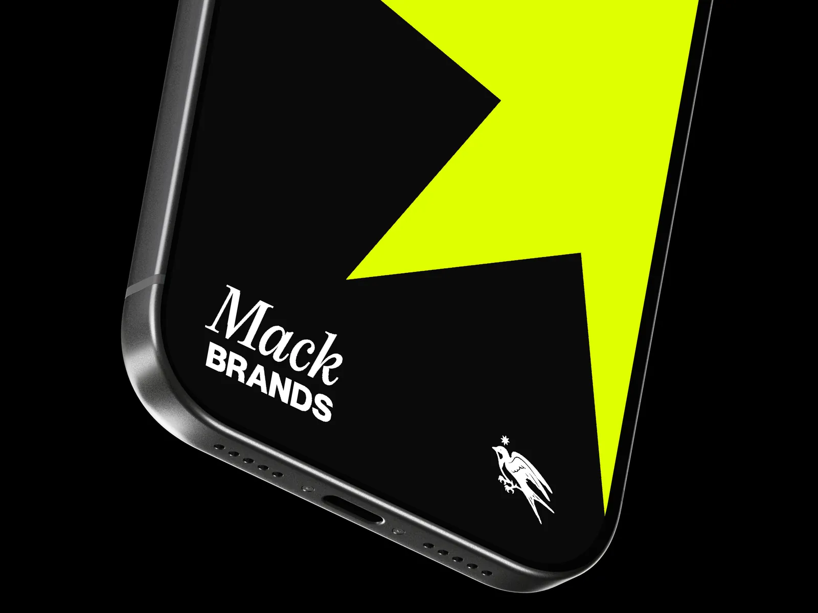
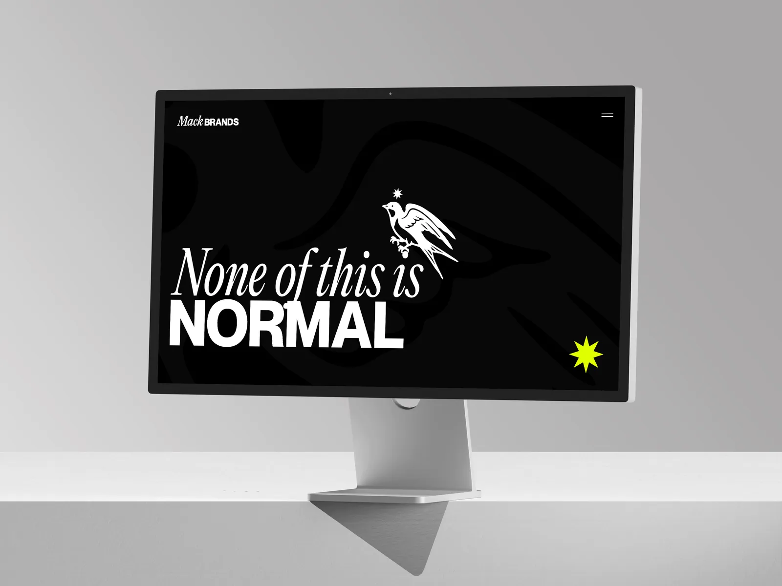
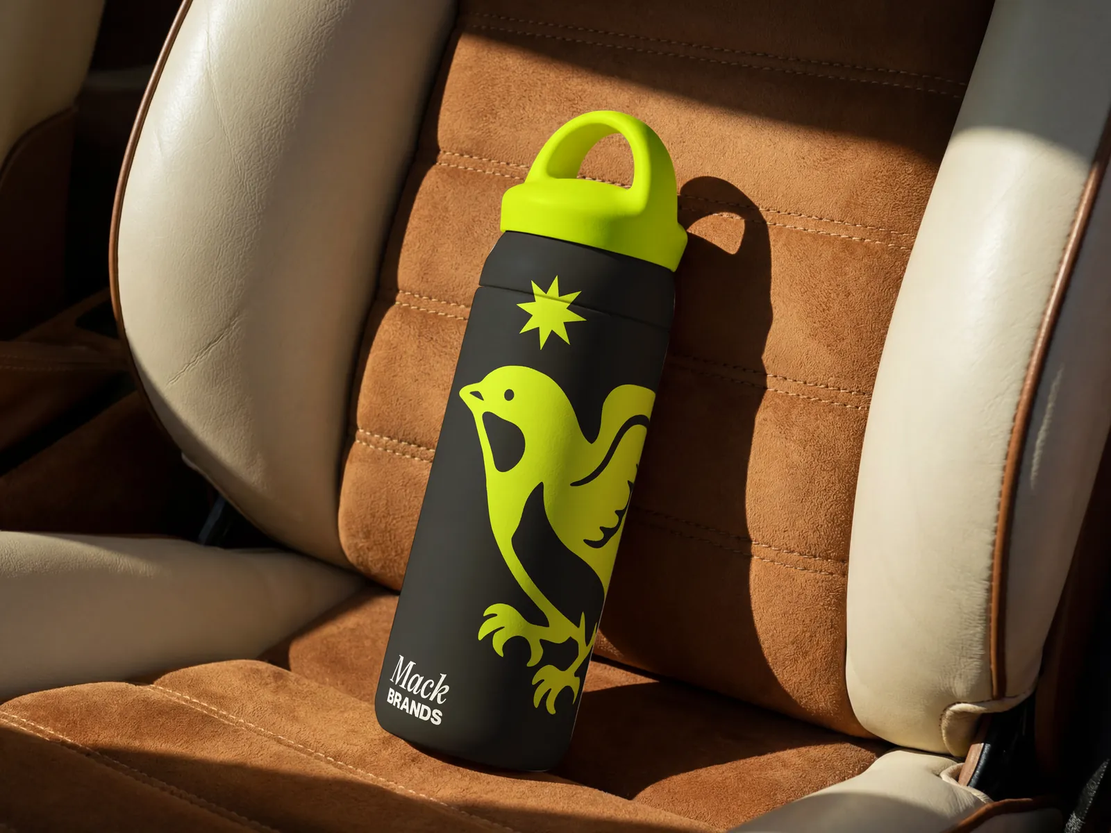
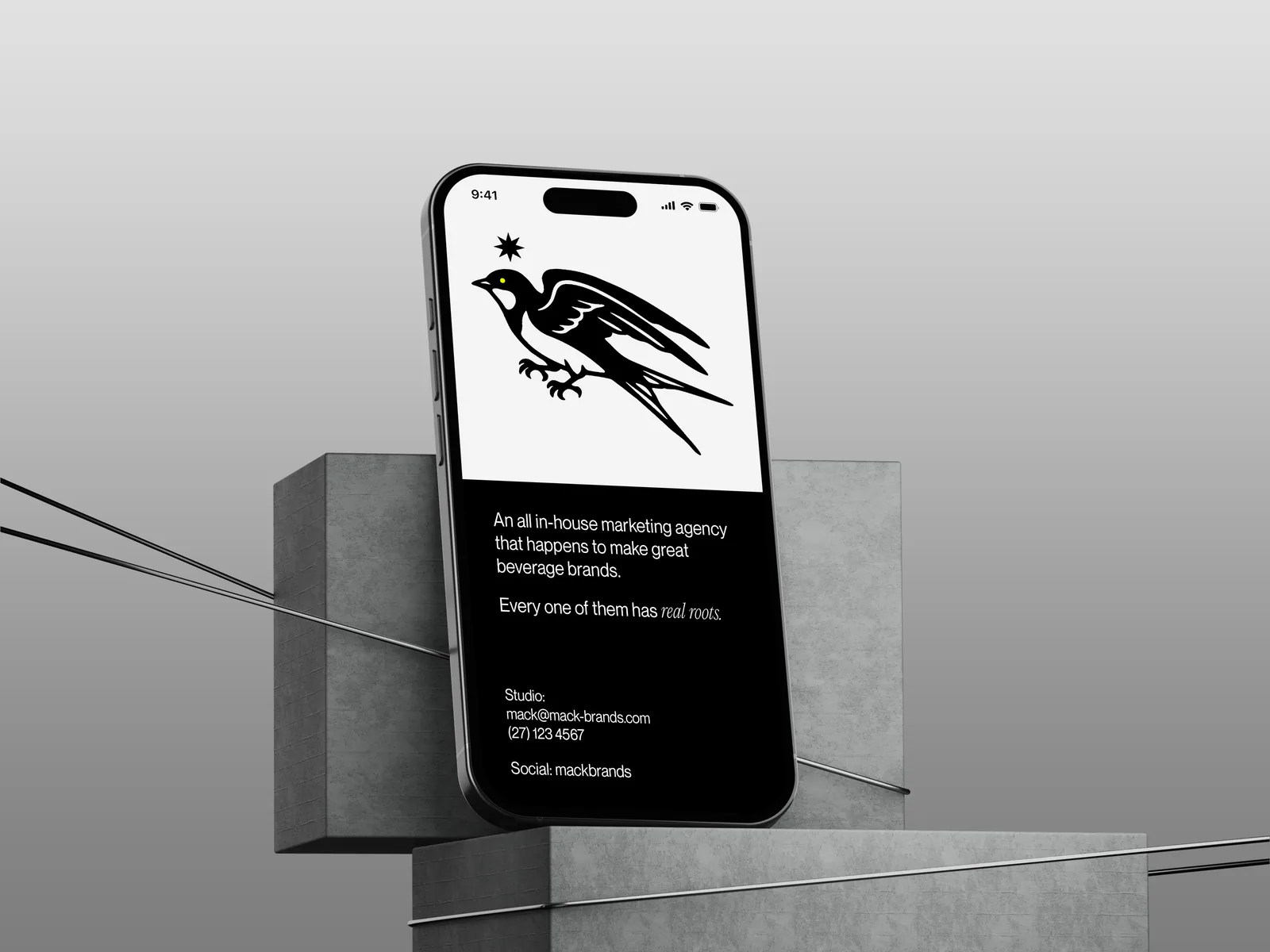
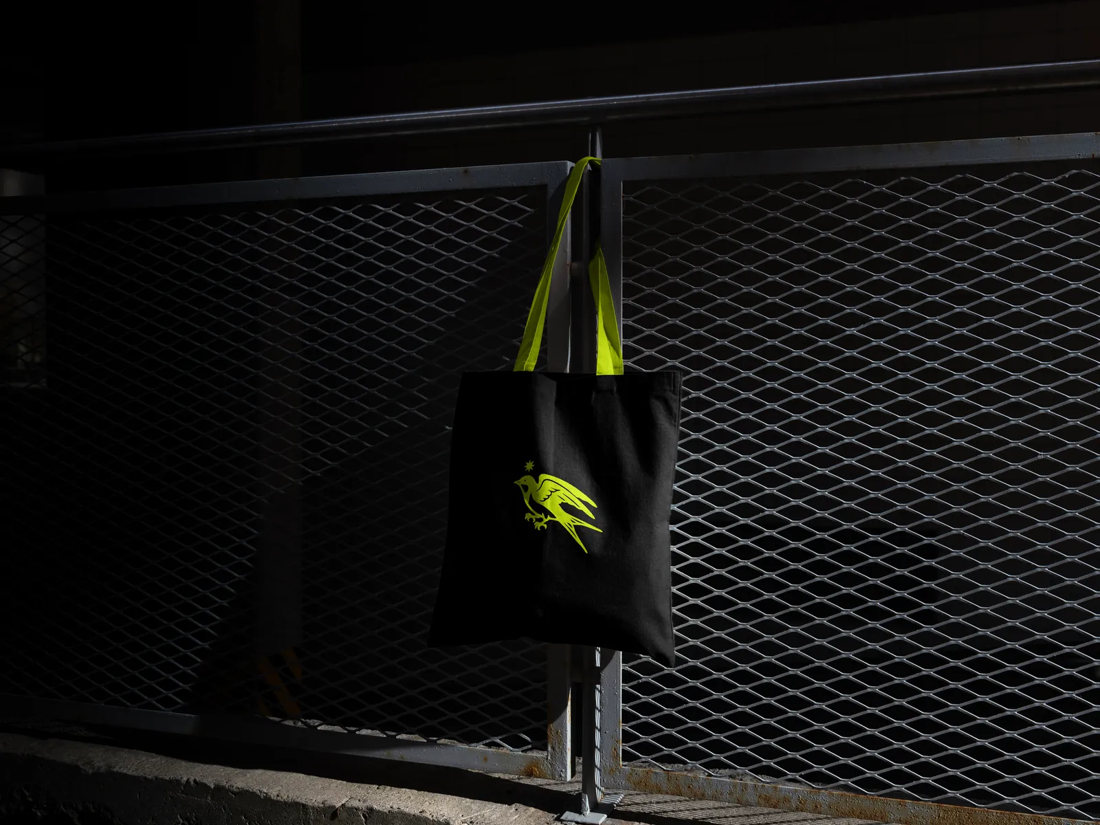
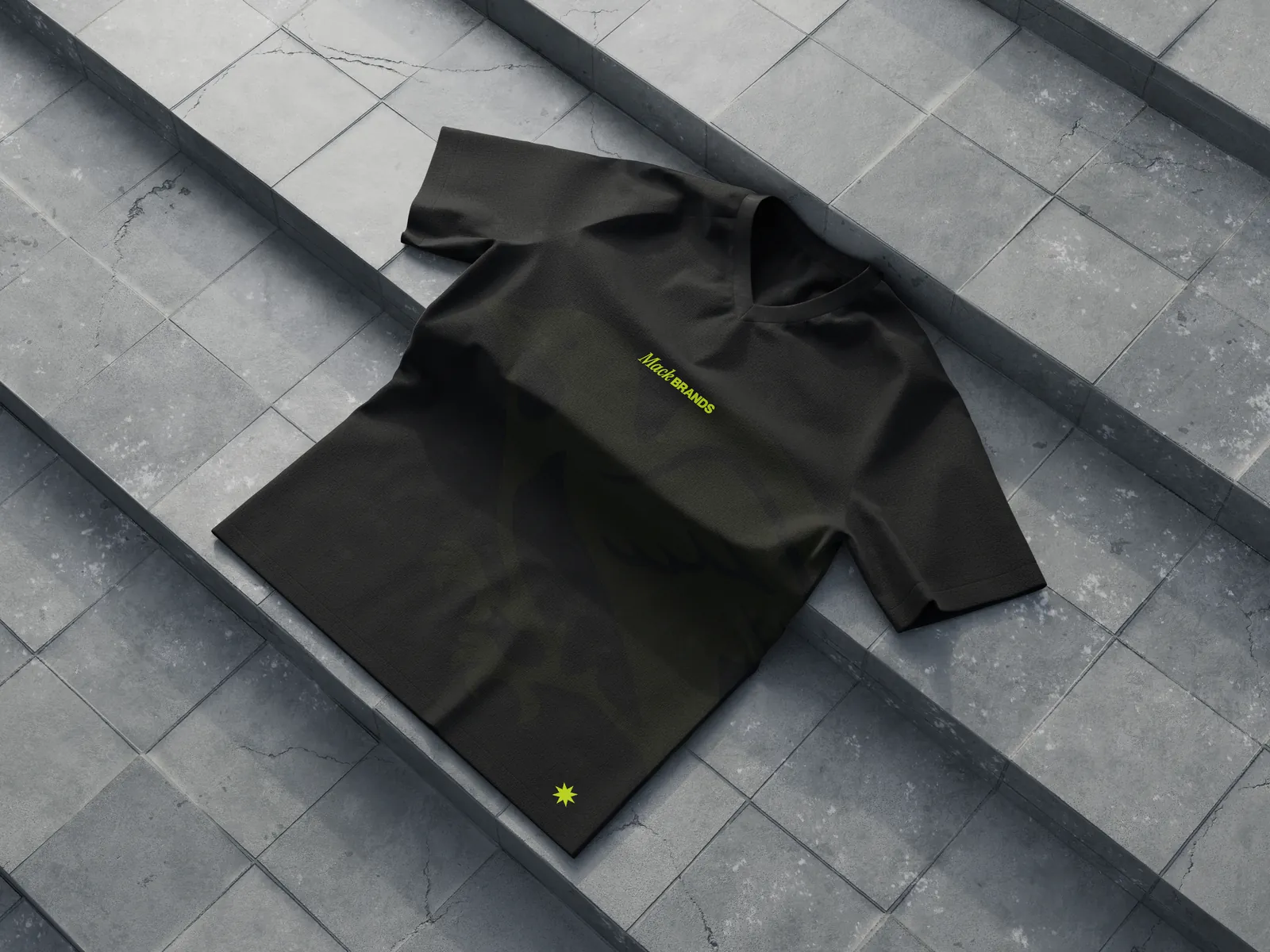
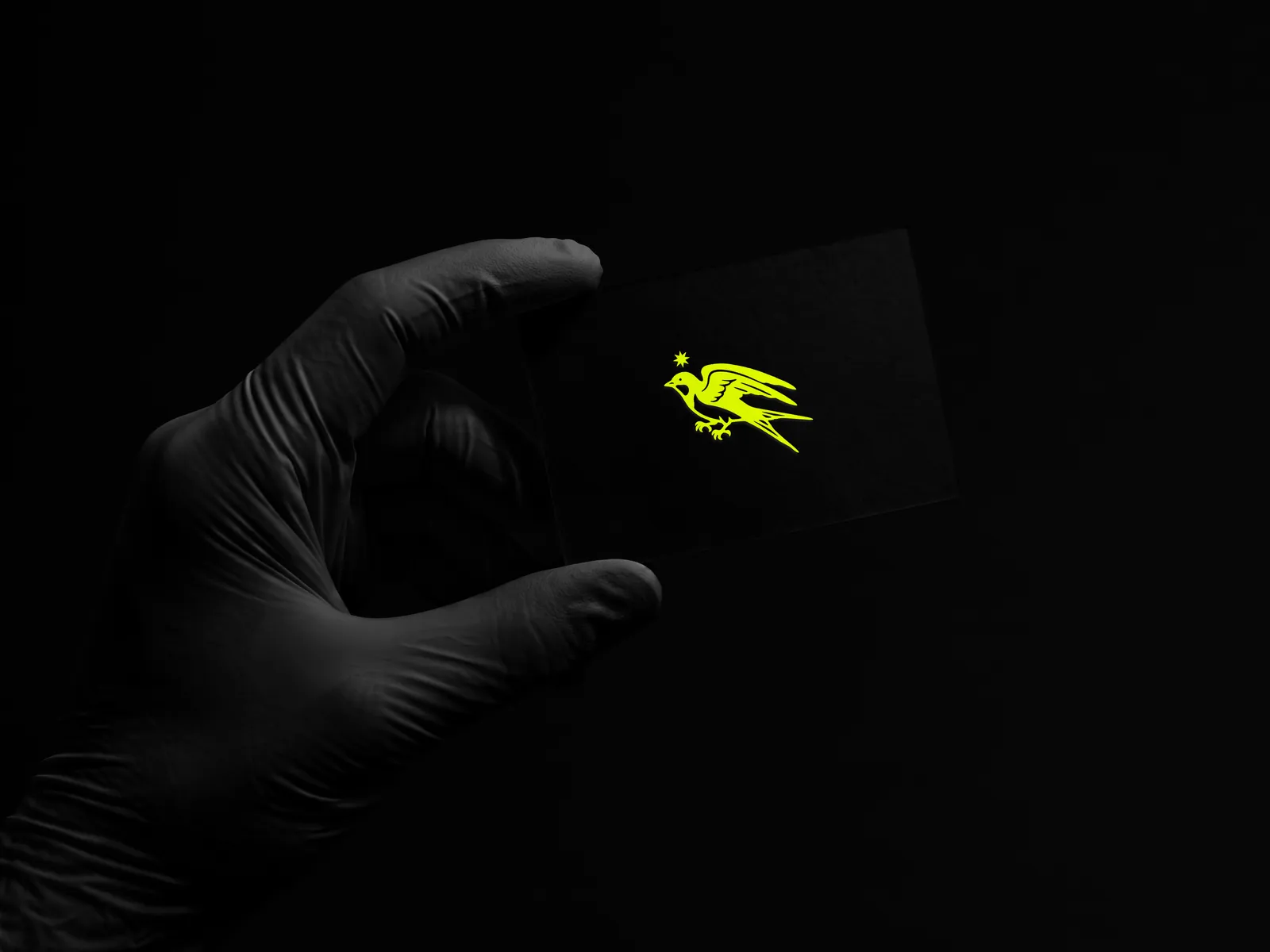
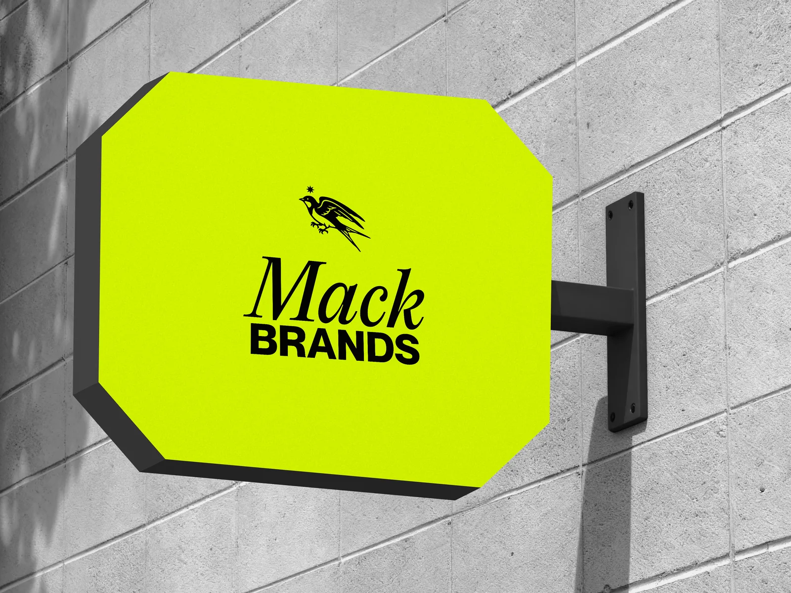
B2B world
Trade deck
Twelve layouts on one grid: cover, contents, section, the brands, figures, words beside a picture, halves, quote, data, team and contact. Use the arrow keys, or swipe.
The PowerPoint template has these and fifteen more: 27 layouts locked in the Slide Master. Type into the boxes and the design stays put.
Contents
- 01Who we are
- 02The brands
- 03In numbers
- 04Working together
Trade presentation 202602
Who we are
An all in-house marketing agency that happens to make great beverage brands.
Every one of them has real roots.
Trade presentation 202603
02
The brands
Trade presentation 202604
The brands
- Tequila RosaluzTequilaOne line on the brand: what it is, where it comes from, who pours it.
- Conte CamilloCocktailsOne line on the brand: what it is, where it comes from, who pours it.
- FinvaraIrish whiskeyOne line on the brand: what it is, where it comes from, who pours it.
Trade presentation 202605
In numbers
00Markets
00Brands
00Partners
00Cases a year
Placeholders: put the real figures in before this goes out.
Trade presentation 202606
Picture
Working together
Words beside a picture. Keep them short: three modules wide, standing on the bottom margin.
Picture
What partners get
Two things of equal weight, side by side. The picture takes one half; the text hangs from the top margin in the other.
- One idea to a line, in Body text.
- The star is the bullet.
- Three or four lines at most.
“The quote, in the words of the person who said it.”
Name Surname, role, company
Trade presentation 202609
Markets
Cases by market
| Market | Cases | Share | Change |
|---|---|---|---|
| Market A | 4,120 | 33% | +8% |
| Market B | 3,860 | 31% | +41% |
| Market C | 2,940 | 24% | +3% |
| Market D | 1,490 | 12% | −2% |
| Total | 12,410 | 100% |
Placeholder figures. One row and one bar out of place: the number that matters.
Cases by year
12,410
20192020202120222023202420252026
The team
Name Surname
Role
Name Surname
Role
Name Surname
Role
Name Surname
Role
Trade presentation 202611
Contact
name@mack-brands.com
mack-brands.com
Trade presentation 202612
Stationery
Name Surname
Company
Street and number
City, postcode
Country
30 October 2026
Subject, set in capitals
Dear Name,
The letter starts here and runs ragged right from the margin, in Neue Montreal at 9.5 pt. One idea to a paragraph; a page holds about 450 words.
Keep it short, then sign off.
With best regards,
Name Surname
Role
Mack Brands
Registered companyStreet and number
City, postcode+00 00 000 0000
mack-brands.com
Registered companyStreet and number
City, postcode+00 00 000 0000
mack-brands.com
Name Surname
Job title
name@mack-brands.com
+00 00 000 0000
mack-brands.com
Name Surname
Role, Mack Brands
+00 00 000 0000 · mack-brands.com

Documents
Trade only
Price list
Prices per case, ex works, excluding duty and VAT. Valid from 1 November 2026.
| Product | Size | Case | Price |
|---|---|---|---|
| Tequila Rosaluz | |||
| Expression one | 70 cl | 6 | 0,000.00 |
| Expression two – new | 70 cl | 6 | 0,000.00 |
| Expression three | 70 cl | 6 | 0,000.00 |
| Conte Camillo | |||
| Expression one | 50 cl | 12 | 0,000.00 |
| Expression two | 50 cl | 12 | 0,000.00 |
| Finvara | |||
| Expression one | 70 cl | 6 | 0,000.00 |
Orders
name@mack-brands.comTerms
30 days from invoiceMack Brands
mack-brands.com
name@mack-brands.comTerms
30 days from invoiceMack Brands
mack-brands.com
An all in-house marketing agency that happens to make great beverage brands.
Every one of them has real roots.
00Markets00Brands00Partners00Cases a year
- Tequila RosaluzTequila
- Conte CamilloCocktails
- FinvaraIrish whiskey
Mack Brands
mack-brands.comTrade
name@mack-brands.comPress
name@mack-brands.com
mack-brands.comTrade
name@mack-brands.comPress
name@mack-brands.com
Digital
None of this isNormal
New partner
One line of news, two at most, in the Title style.
00
Markets, and what the figure means in one line.
Download the background
PNG, 1920 × 1080, . Zoom, Teams and Meet all take it.
Events
None of this isNormal
mack-brands.com
At events, one big thing to a surface. The swallow does the work at distance, the line does it up close.
Downloads
Packs
Everything in one go. Each pack is a zip with the files sorted into folders.
Logo
Every lockup, wordmark and swallow, in Ink, White and Lime. SVG and PNG.
Graphic language, vector
Every pattern as an SVG master: star, Formation, Rhumb, Signal, signet and hallmark.
Formation tiles
The repeat in three colourways, SVG and PNG, ready to tile.
Signet and hallmark
Solid, line and knockout signets, the hallmark row, and the wax and silver renders.
Star
The eight-point star in Ink, Paper and Lime.
Icons
Sixteen icons on the 24 px grid, in Ink and Paper. SVG.
Video call background
1920 × 1080 PNG for Zoom, Teams and Meet.
Aa
Fonts
PP Editorial New and Neue Montreal are licensed, so they are not here. Get them from Pangram Pangram.
Every file
| File | Download |
|---|
Using the files
SVG or PNG
SVG for print, signage and anything that scales. PNG for slides, documents and the web.
Which ground
Ink logos go on Paper, White and Lime. On Ink, use the White or the Lime logo. Which logo where
Room to breathe
Keep at least the cap height of BRANDS clear on every side, and never go below 120 px or 30 mm wide.
Lime in print
Lime is outside CMYK. Print it as a spot colour and draw it down on the real stock before signing off.
Something missing, or a format we have not covered? Ask the brand team before making your own.