None of this is normal: Mack Brands’ new identity follows one rule, then breaks it on purpose
The challenger drinks house behind Tequila Rosaluz, Conte Camillo and Finvara drew its new identity by hand and put a deliberate flaw in every piece.
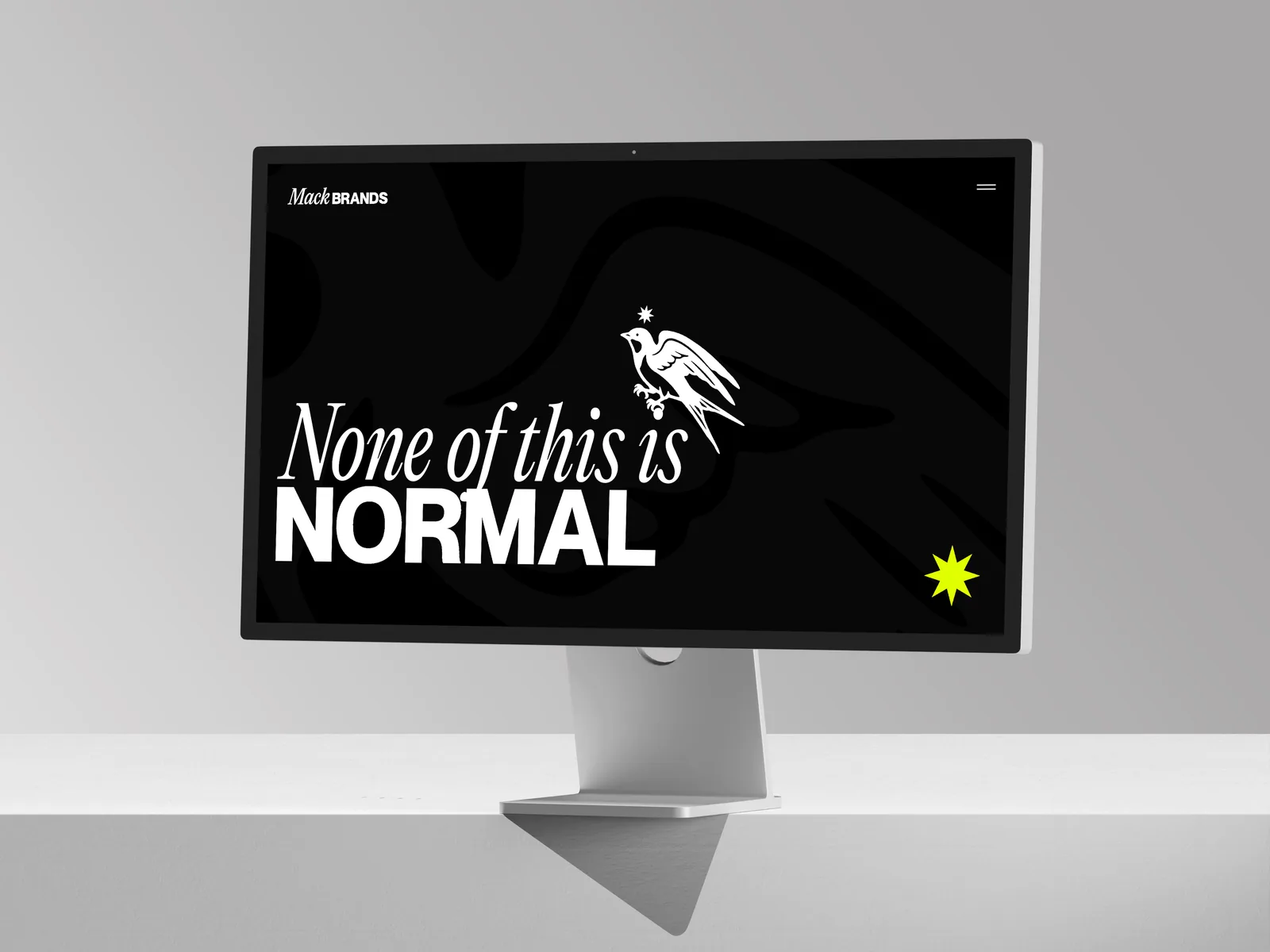
CAPE TOWN and NEW YORK, 19 November 2026: Drinks is a business of centuries-old names, heritage houses and rebrands that play it safe. Mack Brands has never followed that script. Today the challenger drinks house unveiled a new identity built on the line it lives by: none of this is normal.
Creative and Brand Manager Matt Halls alongside his in-house team drew the system by hand. It runs on strict geometry, then breaks it once in every piece. Software would fix that flaw. Mack Brands built it in on purpose.
The new look lands as the business picks up speed. Conte Camillo launched its full five-cocktail range in the US in September, and its 375ml Signature collection sold out in six days. Additive-free Tequila Rosaluz has rolled out in New York. In October, Mack Brands recorded its biggest sales day yet. The business is turning heads, and it isn’t slowing down.
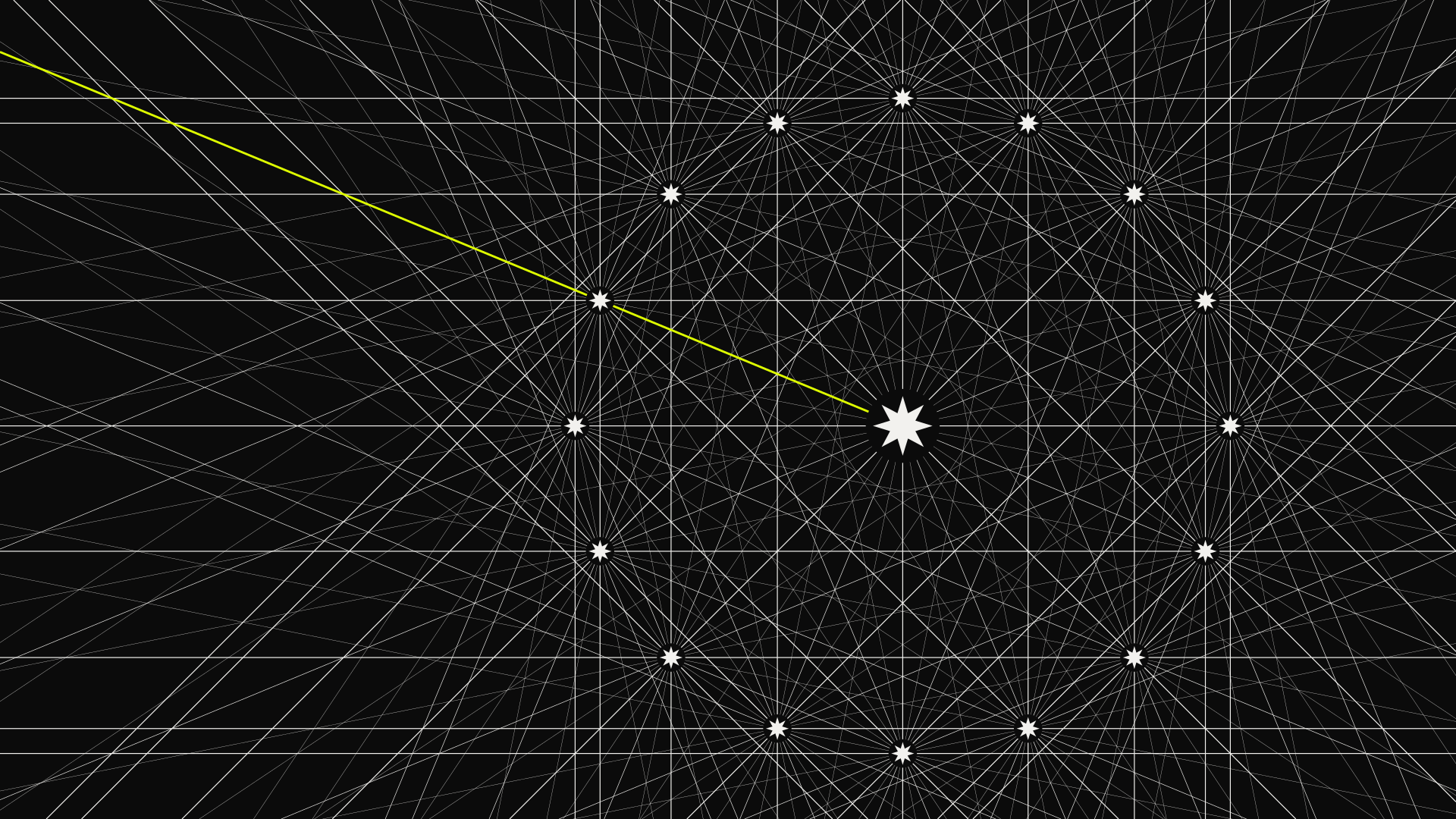
The rule.
One eight-point star sets every angle. One grid, 16 squares wide, sets every layout. Nothing in the system moves without them.
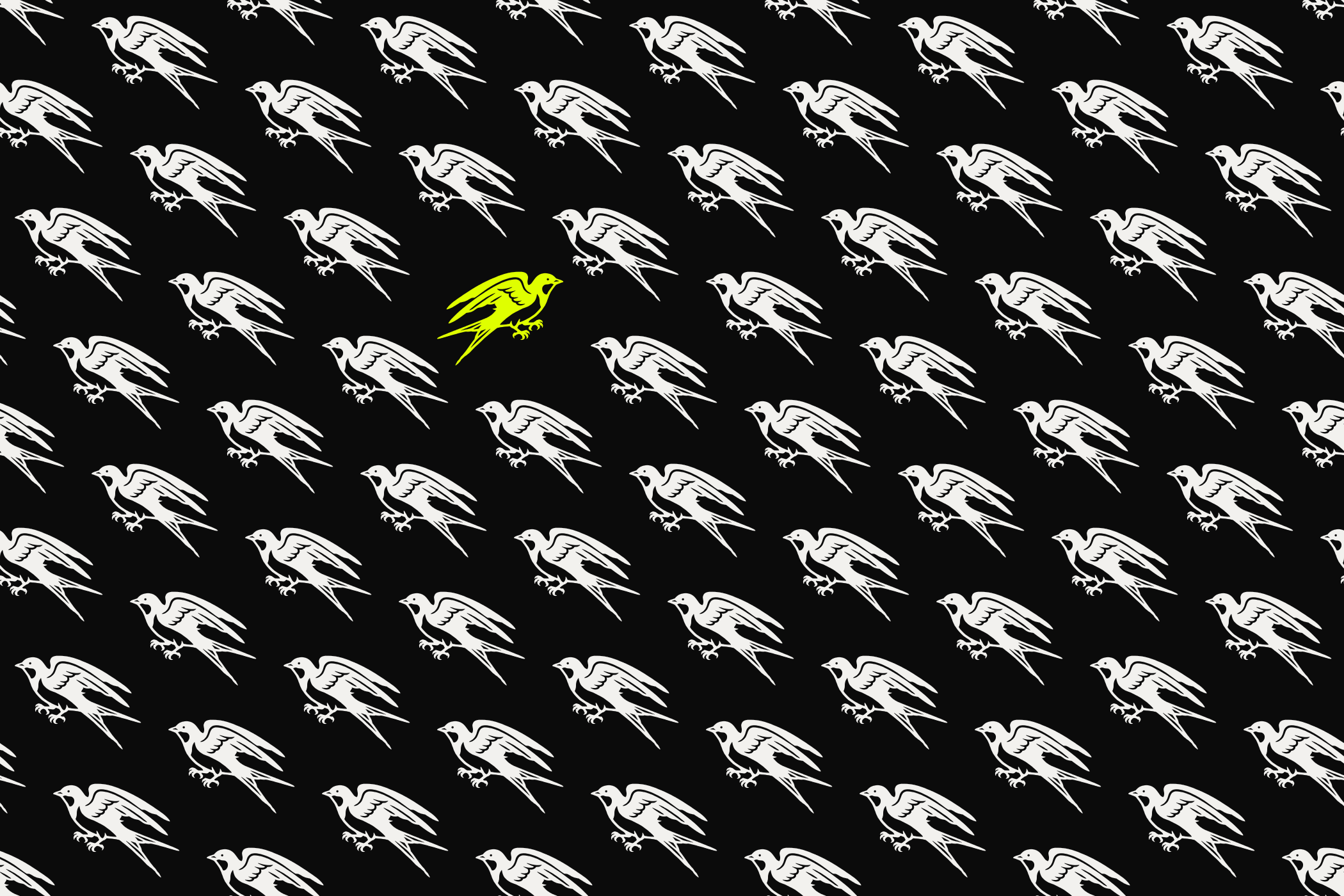
The break.
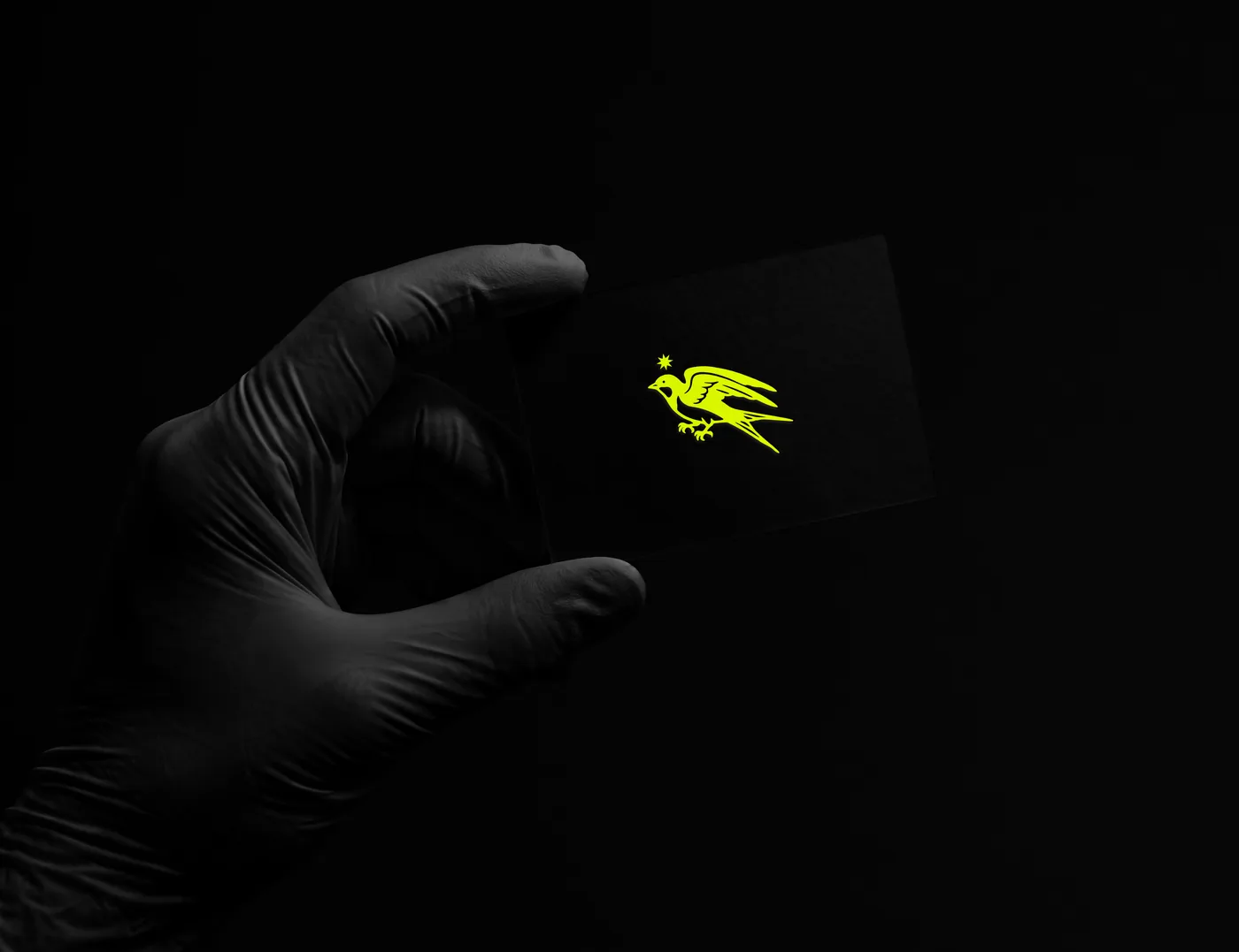
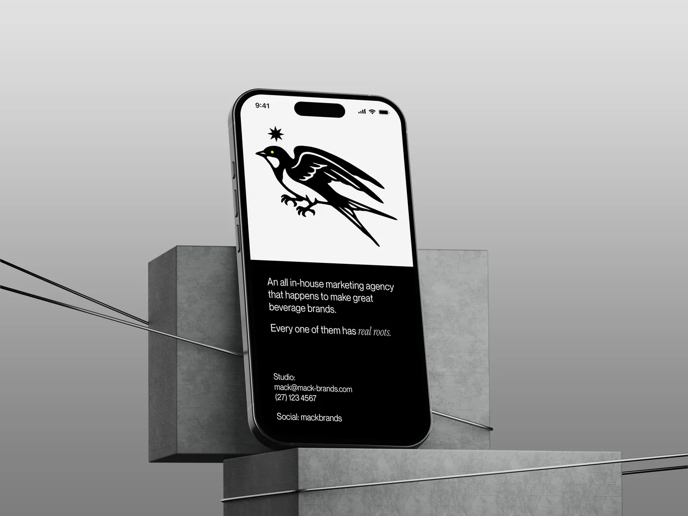
Then every piece breaks the rule once. A swallow flies against the formation. A single star turns lime. One element sits out of place, on purpose. It’s Mack’s creed in visual form: the grid is the discipline, the break is the disruption, and the hand-drawn finish is the detail.
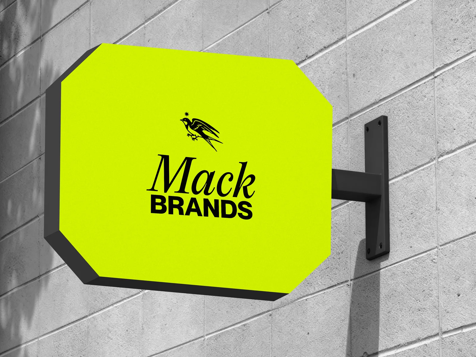
The swallow.
Sailors once tattooed swallows as a promise to make it home. The Mack Brands emblem pairs a swallow with an eight-point North Star, the star sailors steered by. For Mack, the mark stands for taking brands with deep roots into new markets without losing what makes them distinct. The wordmark sets “Mack” in an italic serif for heritage, and “BRANDS” in bold capitals.
“I wanted the precision of something new and respect for the heritage behind our brands,” says Matt Halls, Creative and Brand Manager at Mack Brands. “One star sets every angle. One grid sets every layout. Then I break the rule once, on purpose, in every piece. That’s how you know a person drew it. None of this is normal.”
“Drinks has been run by the same names, the same way, for generations,” says Nicolas Mack, Founder and CEO. “We’re the challenger, and we act like one. This identity is a statement: we’re not here to sit politely next to the biggest names in drinks. We’re here to take them on.”
The identity goes live today across Mack Brands’ corporate, investor and trade channels. Over the coming weeks, a design breakdown series will cover the emblem, the grid and the typography.